Dude! Take Your Turn!
A Gaming Life
Smash Up Arrives on Digital – Extremely First Impressions
I’ve become a fan of the Smash Up card game, where you combine two different factions (Zombie Dinosaurs!!!!) into a deck of cards and try to reach 15 victory points by “breaking” bases before anybody else does.
You do this by playing minions there that have a certain amount of power, along with actions that can increase/decrease that power or let you play additional minions or do a lot of other wacky stuff that I’m not going to get into right now.
What I am going to get into is the fact that this game has finally come out for mobile devices!
Developed by Nomad Games and released by Asmodee Digital, this digital version of the game has nine factions (Dinosaurs, Pirates, Geeks, Zombies, Wizards, Robots, Ninjas, Tricksters and Aliens) to use, with more coming in the expansions I’m sure.
It’s so cool that this is finally available!

Isn’t it?
Well…..yes and no.
Let me explain.
First of all, let me confirm that I have not played a full game of this yet. This post will not talk about the quality of the AI, how multi-player works (it sounds like it’s not async, sadly) or anything like that.
That’s why it’s titled “Extremely First Impressions.”
I’m mainly going to be talking about the playing interface.
It’s dreadful on a regular-sized iPhone. I can’t imagine it’s much better on the iPad except that maybe you might (just might) be able to see (with a magnifying glass) what a card says without zooming it.
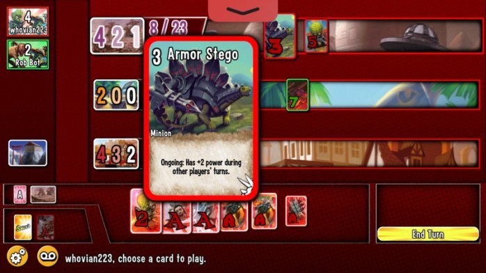
Sure, you can tap a card and hold it to read what the description is and what its ability (if any) is, but it doesn’t stay up there if you let it go. If you move your finger, suddenly you’re looking at another card.
What happened to “double tap a card and it will zoom, hit ‘cancel’ or ‘play’ to continue”? Why did you have to make it so difficult to actually see what card you want to play?
Not to mention the fact that it makes it almost impossible to take a screenshot with the card shown (my fingers still hurt from the Twister-like contortions required to take the above shot). But I guess that only affects us bloggers and those who must take as many pictures as possible.
Let’s get to the bases.
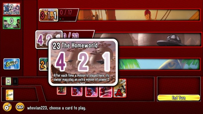
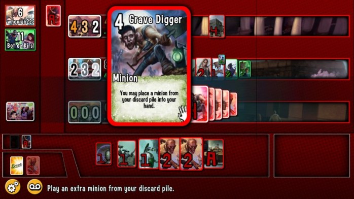
I love how it gives you what the break level of a base is without zooming, but bases have effects. Some are when they score, and some are when you play (such as you can play another minion on this base that costs 2 or less when you play a minion here). But you have to tap the base to blow it up and see.
If you happen to have a minion or action selected to play, be careful. Tapping without actually holding will play that card on the base.
No mulligans. It’s played and you can’t take it back.
Whoops!!!
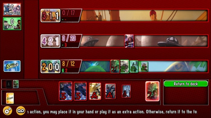
It’s also counter-intuitive that you can’t actually drag cards anywhere. You have to tap the card you want to play so that it goes into the “to be played” box (not sure what it’s officially called). You then have to choose a base you want to play it on by tapping the base.
You can’t just drag it to the base.
I understand that this will prevent accidental plays when you drag it to the wrong base, but the option would still be nice (especially on the iPad, which is bigger).
Also, some cards have abilities that let you do things like return minions to the owner’s hand or do some other things, and it’s not entirely clear at times how to move forward.
There are some nice things about the interface, though.
I do like how it tells you whether a card is an action or whether it’s a minion, and if it’s a minion, what its strength is. Unfortunately, since it doesn’t tell you what the minion’s ability is, you still have to hold it, but at least you have an idea.
Also, I’m glad that the base gives the current power level at a base, and how much power each player is contributing (red/green in the screenshot). That is really handy.
In the above shot, the bottom base (oh yeah, have to tap it to see what the heck it is) has 8 power and will break at 12. Rob Bot is contributing 6 power to it and I am contributing 2.
Basically, the main problem with the interface is seeing what cards you have, how to play them and what they can do in an easy manner. Why do you have to hold things to keep it up?
It’s ridiculously bad design and I hope it gets changed in an update soon.
Would be nice to have asynchronous multiplayer as well, but this is Asmodee so we shouldn’t hold our breath.
Anyway, I did buy the game, and I will probably enjoy playing it. But it would be so much better without the clunky interface getting in the way of players enjoying themselves.
One side note before I close.
It would also be nice to have an option to limit the factions taken so that there can be no duplicates (like the regular card game). I understand that it’s cool to let people both take Dinosaurs because it’s digital and thus there are no physical cards.
But some people don’t like that, and it would be great to have a toggle option to say “don’t allow that.”
Anyway, I hope these issues are fixed.
I think they will greatly affect players’ enjoyment of the game.
Over to you, Asmodee!
Edit (10/13/17) – Just wanted to update my thoughts on this because I had the chance to play an actual game on the iPad last night.
And I’m just as annoyed, maybe even more so, because of one aspect of the game that I had forgotten about and how the UI makes that aspect horrendously difficult.
So I played the game on my iPad last night, and played the Zombie Geeks against the Pirate Geeks (really, Nomad Games, please give us the option to not allow duplication).
The Zombie deck in particular has a number of cards that require you to search your deck or your discard pile. The Tenacious Z card is playable from your discard pile as an extra minion, for example.
That’s when I discovered how incredibly annoying it is to try and scroll through all of the cards that come up for you to search through.
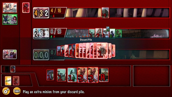
Look at that. A lot of cards (and that’s just a discard pile that’s not *that* full).
You press on a card and then have to move your finger to scroll through all of the available cards, holding your finger against the screen the whole time.
Better not accidentally lift your finger!
It’s really terrible that you have to do this. Why not double tap a card and then be able to scroll between all of your cards?
I finished my game on my iPad and my finger was actually tired because of the number of times I had to search my deck, search my discard pile, or whatever.
Please, Asmodee and Nomad. Get this changed.
Soon.

Hey, I enjoy your blog – in particular the mix of reviews of real and digital versions.
There’s an accessibility feature that might save your aching fingers when taking screenshots: in the general > accessibility settings look for assistive touch – activate it then you can customise it to put a floating dot on screen which takes screenshots when tapped – it can be tapped, held and dragged anywhere if it’s in the way and doesn’t appear in the screenshots.
All the best
Tim
LikeLiked by 1 person
Thank you! I didn’t know about that.
I don’t really need it. Except for when taking screenshots of Smash Up because you need 3 freakin’ fingers in order to take the screenshot the normal way.
But when that happens, I’ll know how to do it now!
And thank you for the kind words as well. I’m glad you enjoy!
LikeLike
Pingback: Nomad Games to Add a New Expansion to Smash Up App – Dude! Take Your Turn!
Pingback: Async App Plays and Recording Boardgame Stats – Dude! Take Your Turn!